Archiv des Autors: aud
Shooting training
UNIS
Visitng the bird cliff – day 2
Plant Functional Trait Course 4 – Svalbard
The devil is in the detail
The devil is in the detail: Nonadditive and context‐dependent plant population responses to increasing temperature and precipitation
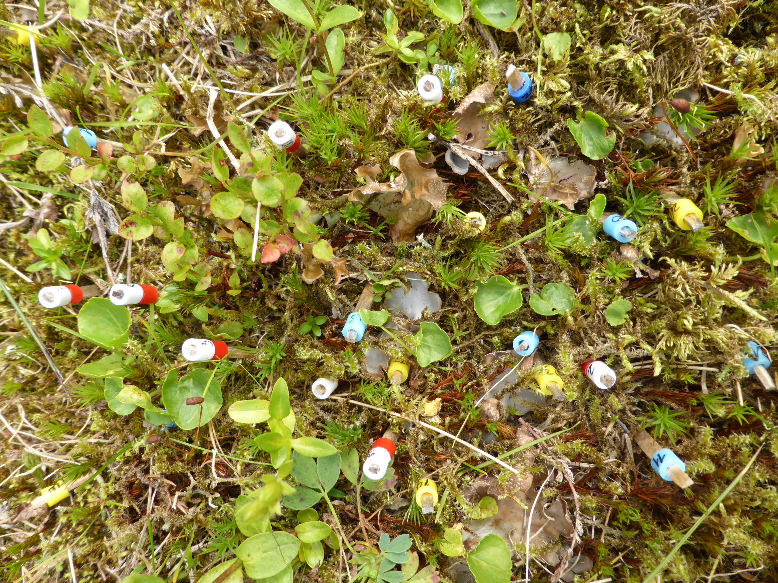
Plants marked with toothpicks for demographic study. Picture: Siri Lie Olsen
In climate change ecology, simplistic research approaches may yield unrealistically simplistic answers to often more complicated problems. In particular, the complexity of vegetation responses to global climate change begs a better understanding of the impacts of concomitant changes in several climatic drivers, how these impacts vary across different climatic contexts, and of the demographic processes underlying population changes. Using a replicated, factorial, whole‐community transplant experiment, we investigated regional variation in demographic responses of plant populations to increased temperature and/or precipitation. Across four perennial forb species and 12 sites, we found strong responses to both temperature and precipitation change. Changes in population growth rates were mainly due to changes in survival and clonality. In three of the four study species, the combined increase in temperature and precipitation reflected nonadditive, antagonistic interactions of the single climatic changes for population growth rate and survival, while the interactions were additive and synergistic for clonality. This disparity affects the persistence of genotypes, but also suggests that the mechanisms behind the responses of the vital rates differ. In addition, survival effects varied systematically with climatic context, with wetter and warmer + wetter transplants showing less positive or more negative responses at warmer sites. The detailed demographic approach yields important mechanistic insights into how concomitant changes in temperature and precipitation affect plants, which makes our results generalizable beyond the four study species. Our comprehensive study design illustrates the power of replicated field experiments in disentangling the complex relationships and patterns that govern climate change impacts across real‐world species and landscapes.
Picture on title page
My new paper on trait differentiation and adaptation along elevational gradients is out. And my picture is on the title page!

Abstract
Studies of genetic adaptation in plant populations along elevation gradients in mountains have a long history, but there has until now been neither a synthesis of how frequently plant populations exhibit adaptation to elevation nor an evaluation of how consistent underlying trait differences across species are. We reviewed studies of adaptation along elevation gradients (i) from a meta‐analysis of phenotypic differentiation of three traits (height, biomass and phenology) from plants growing in 70 common garden experiments; (ii) by testing elevation adaptation using three fitness proxies (survival, reproductive output and biomass) from 14 reciprocal transplant experiments; (iii) by qualitatively assessing information at the molecular level, from 10 genomewide surveys and candidate gene approaches. We found that plants originating from high elevations were generally shorter and produced less biomass, but phenology did not vary consistently. We found significant evidence for elevation adaptation in terms of survival and biomass, but not for reproductive output. Variation in phenotypic and fitness responses to elevation across species was not related to life history traits or to environmental conditions. Molecular studies, which have focussed mainly on loci related to plant physiology and phenology, also provide evidence for adaptation along elevation gradients. Together, these studies indicate that genetically based trait differentiation and adaptation to elevation are widespread in plants. We conclude that a better understanding of the mechanisms underlying adaptation, not only to elevation but also to environmental change, will require more studies combining the ecological and molecular approaches.
OpenTraits
The popularity of using traits data in ecology has increased a lot in the last years. Traits can be used to describe species communities across different regions and how they respond to environmental change, and much more.
The goal of OpenTraits is to increase our global knowledge of traits from different organisms by
- Developing shared data standards;
- Developing open-source tools and techniques for gathering, cleaning, curating, and analyzing trait data;
- Developing methods for the prioritization of trait sampling;
- Increasing collaboration among trait researchers; and
- Organizing trait sampling efforts for priority regions, taxa and traits.
If you are interested to learn more about OpenTraits, there is a blog post on the Functional Ecologist blog and there will be a workshop prior to the Ecological Society of America annual meetings, New Orleans, Louisiana, USA (August 4-5, 2018).

Working and Learning in a Field Excursion
A colleague has published an article on how biology students learn on field excursions. In addition, to study and learn about nature, these students were themselves being observed by Torstein Nielsen Hole, currently a PhD candidate at bioceed, university of Bergen.
For this study he joined a field course on Svalbard. It’s interesting to read about how biologists discuss their work in the field. And the article covers all from bare soil, death and guns (protection from polar).
Alternatives to barplots
I reviewed a paper the other day. The data was presented in a barplot and a collegue told me to suggest the authors to use a boxplot or something similar instead. So, I thought I would make some suggestions of alternatives to barplots.
BARPLOTS
Barplots are very commonly used in newspapers or magazins to show numbers. But they are often misused. Barplots should be used to plot count data, e.g. histograms. For plotting any other data, they are less well suited. The problem with barplots is that they hide a lot of useful information and there are better ways to plot your data.
Barplots show a single value (e.g. a mean of many data points) and error bars can be added.
# Define colours (color blind palette: http://www.cookbook-r.com/Graphs/Colors_(ggplot2)/)
cbPalette <- c("#999999", "#E69F00", "#56B4E9", "#009E73", "#F0E442", "#0072B2", "#D55E00", "#CC79A7")

# Draw a barplot of mean Septal length of three iris species
iris %>%
  group_by(Species) %>%
  summarize(n = n(), Mean.Sepal.Length = mean(Sepal.Length), SE = sd(Sepal.Length)/sqrt(n)) %>%
  ggplot(aes(y = Mean.Sepal.Length, x = Species, ymin = Mean.Sepal.Length - SE, ymax = Mean.Sepal.Length + SE, fill = Species)) +
  geom_bar(stat = "identity") +
  geom_errorbar(width = 0.15) +
  scale_fill_manual(values = cbPalette) +
  labs(x = "", y = "Mean sepal length")

BOXPLOT
Boxplots are more informative. They show the median (thick line), first and third quartile (box), wiskers showing the minimum/maximum (for exact definition type ?geom_boxplot) and outliers (points).
# Draw a boxplot of mean Septal length of three iris species

g <- ggplot(iris, aes(y = Sepal.Length, x = Species, fill = Species)) +
  scale_fill_manual(values = cbPalette) +
  labs(x = "", y = "Mean sepal length")
g +   geom_boxplot()

In ggplot it is possible to plot several layers on top of each other. In addition to the boxplot it is possible to plot each observation using geom_point() or geom_jitter(). This adds information about the sample size.
g +   geom_boxplot() +
  geom_jitter(shape = 16, colour = "grey", alpha = 0.5, width = 0.2)

VIOLIN PLOT
Violin plots give you even more information about the data. They also show the kernel probability density of the data at different values. It is also possible to show median and the quartiles, like a normal boxplot, use draw_quantiles = c(0.25, 0.5, 0.75). Or you can add a boxplot on top of the violin plot with adding: + geom_boxplot(width = 0.2)
An alternative is to use stat_summary to plot mean and standard deviation insde the violin plot.
# Draw violin plot
g + geom_violin(trim = FALSE) +
  stat_summary(
    fun.data = "mean_sdl",  fun.args = list(mult = 1),
    geom = "pointrange", color = "black"
    )

SINA PLOT
A sinaplot is useful, becuase is also shows you the sample size of the data. The sample size is usually mentioned somewhere in the text, but it is nice to have it visually presented in the figures. Especially when different groups have different sample sizes.
The sinaplot shows each data point and they are arranged like a violin plot. So you have the sample size, density distribution.
“sinaplot is inspired by the strip chart and the violin plot. By letting the normalized density of points restrict the jitter along the x-axis the plot displays the same contour as a violin plot, but resemble a simple strip chart for small number of data points. In this way the plot conveys information of both the number of data points, the density distribution, outliers and spread in a very simple, comprehensible and condensed format” (https://cran.r-project.org/web/packages/sinaplot/vignettes/SinaPlot.html)
library("ggforce")

# removing some observations to get uneven sample size
iris2 <- iris %>%
  filter(!(Species == "setosa" & Sepal.Length > 5))

# Sinaplot


ggplot(iris2, aes(y = Sepal.Length, x = Species)) +
  labs(x = "", y = "Mean sepal length") +
  geom_sina(aes(colour = Species), size = 1.5) +
  scale_color_manual(values = cbPalette)
