Do you also love Wes Anderson movies? Today, I learnt that there are Wes Anderson colour palettes for R. So from now on you can colour your ggplots according to Rushmore, The Grand Budapest Hotel or The Isle of Dogs.
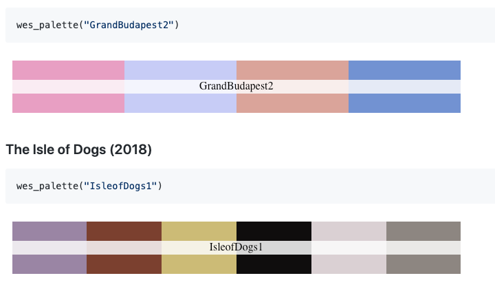
Do you also love Wes Anderson movies? Today, I learnt that there are Wes Anderson colour palettes for R. So from now on you can colour your ggplots according to Rushmore, The Grand Budapest Hotel or The Isle of Dogs.
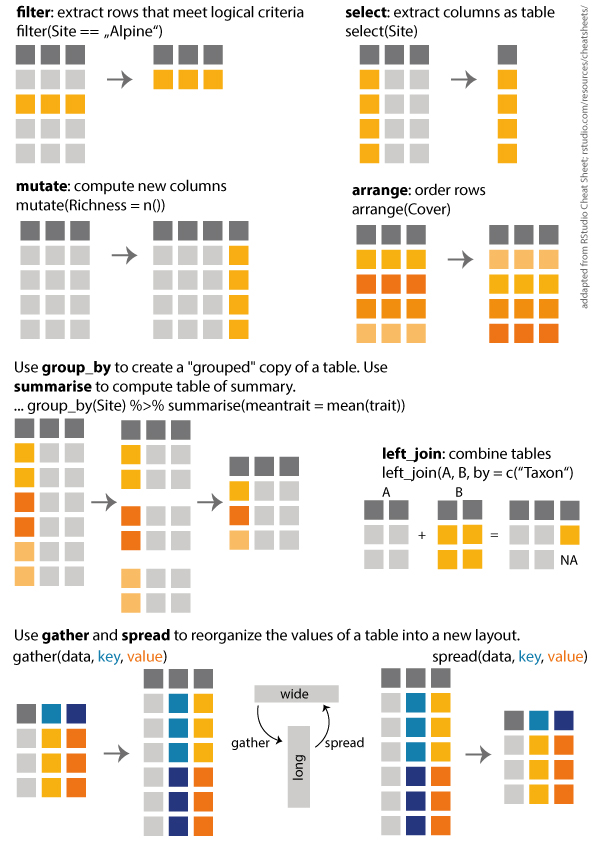
I made a overview of the dplyr functions i use most often. The overview is heavily adapted from RStudio Cheat Sheets, and I made it for the students in my Ecology class. Yes, we do use R in a basic ecology class. Here you can download a pdf.

It is getting more and more common to share data or work colaboratively when collecting and/or analysing data. A useful tool when working with collegues are online solutions. And without saying that this is the best or the only one, I often use google sheet, because many people have access and it is easy to use.
On a course a couple of weeks ago, where we collected a lot of data, I had several students type data into the same goole sheet. The question was then, do I download the table and then import it to R or is is there a direct way. And of course it is possible to import a google sheet directly to R. I discoverd the googlesheets package! It is very easy to use.
You need to have google account. The first time, you need to login to your google account and accept the connection with R. In some cases you will get a code that you have to type a code into the console in R (not sure when and why).
And here some useful functions:
#### IMPORT DATA FROM GOOGLESHEET ####

# install (only the first time) and load library
install.packages("googlesheets")
library("googlesheets")

# Check which tables you have access to
gs_ls()

# Register a google sheet (metadata about the sheet)
Sheet <- gs_title("NameOfGooglesheet")

# list worksheets
gs_ws_ls(Sheet)

# reads the googlsheets and returns as data frame
dat <- gs_read(ss = Sheet, ws = "NameOfSheet") %>% as.tibble()
“Everything is possible in R”
This might not be an everyday problem, but doing this task by hand would take forever. And when finished, I would have to start all over again, because of a tiny litte change. I realized, R code is the only solution!
Here is the problem: I am writing a paper with 109 authors. This is a challenging task in itself. But a couple of days ago I realized writing the author list and their affiliations, arranged by the authors last name and numbered affiliations would be a very tedious task. And as soon as it was done, one of the author would tell me about a new affiliation and another one that this affiliation was old and so on. It did not need a lot of persuasion before I opened R and started to type.
Lets assume we have three authors (we keep it simple for now). We will also need to load the tidyverse library, which is not shown here.
# Make a data frame with 4 columns
dat <- data.frame(FirstName = c("Harry James", "Fleur", "Viktor"),
           LastName = c("Potter", "Delacour", "Krum"),
           Affiliation1 = c("Hogwarts School of Witchcraft and Wizardry, UK", "Beauxbatons Academy of Magic, France", "Durmstrang Institute for Macigal Learning, Russia"),
           Affiliation2 = c(NA, "Hogwarts School of Witchcraft and Wizardry, UK", "Hogwarts School of Witchcraft and Wizardry, UK"))
dat
##     FirstName LastName                                      Affiliation1
## 1 Harry James   Potter    Hogwarts School of Witchcraft and Wizardry, UK
## 2       Fleur Delacour              Beauxbatons Academy of Magic, France
## 3      Viktor     Krum Durmstrang Institute for Macigal Learning, Russia
##                                     Affiliation2
## 1                                           <NA>
## 2 Hogwarts School of Witchcraft and Wizardry, UK
## 3 Hogwarts School of Witchcraft and Wizardry, UK
The next step is to prepare the table for what we want to do. Here you can rename columns, filter the table, rearange it etc. For this table we only want to merge the 2 columns containing the affiliations into a single column. We will use “gather” for this.
# Prepare data
dat <- dat %>%
  # gather all affiliations in one column
  gather(key = Number, value = Affiliation, Affiliation1,  Affiliation2) %>%
  # remove rows with no Affiliations
  filter(!is.na(Affiliation))
Then we need to do the following:
# Function to get affiliations ranked from 1 to n (this function was found on Stack Overflow)
rankID <- function(x){
  su=sort(unique(x))
  for (i in 1:length(su)) x[x==su[i]] = i
  return(x)
}


NameAffList <- dat %>%
  arrange(LastName, Affiliation) %>%
  rowwise() %>%
  # extract the first letter of each first name and put a dot after each letter
  mutate(
    Initials = paste(stringi::stri_extract_all(regex = "\\b([[:alpha:]])", str = FirstName, simplify = TRUE), collapse = ". "),
    Initials = paste0(Initials, ".")) %>%
  ungroup() %>%
  # add a column from 1 to n
  mutate(ID = 1:n()) %>%
  group_by(Affiliation) %>%
  # replace ID with min number (same affiliations become the same number)
  mutate(ID = min(ID)) %>%
  ungroup() %>%
  # use function above to assign new ID from 1 to n
  mutate(ID = rankID(ID)) %>%
  #Paste Last and Initials
  mutate(name = paste0(LastName, ", ", Initials))
The last thing we need to do is to print a list with all the names + IDs and one with all the affiliations + IDs.
# Create a list with all names
NameAffList %>%
  group_by(LastName, name) %>%
  summarise(affs = paste(ID, collapse = ",")) %>%
  mutate(
    affs = paste0("^", affs, "^"),
    nameID = paste0(name, affs)
         ) %>%
  pull(nameID) %>%
  paste(collapse = ", ")
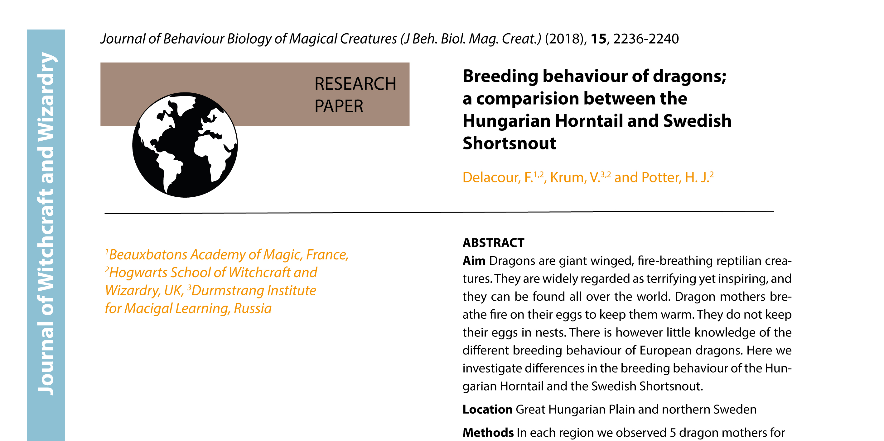
## [1] "Delacour, F.^1,2^, Krum, V.^3,2^, Potter, H. J.^2^"
# Create a list with all Affiliations
NameAffList %>%
  distinct(ID, Affiliation) %>%
  arrange(ID) %>%
  mutate(ID = paste0("^", ID, "^")) %>%
  mutate(Affiliation2 = paste(ID, Affiliation, sep = "")) %>%
  pull(Affiliation2) %>%
  paste(collapse = ", ")
## [1] "^1^Beauxbatons Academy of Magic, France, ^2^Hogwarts School of Witchcraft and Wizardry, UK, ^3^Durmstrang Institute for Macigal Learning, Russia"
Et voilà! Names and affiliations:
Delacour, F.1,2 Krum, V.3,2 Potter, H. J.2
1Beauxbatons Academy of Magic, France, 2Hogwarts School of Witchcraft and Wizardry, UK, 3Durmstrang Institute for Macigal Learning, Russia
Here is one final trick! If this list is used in a paper, the IDs for the affiliations should be superscripts. This can of course be done manually, but again, with 109 authors… So, this is why I added the ^ before and after the numbers. If you copy the name and affiliation lists into an R markdown file and run it (or produce them directly in an R markdown file), the numbers will become superscript.
Thank you Richard Telford for helping with this code and generally stimulating conversations about coding.
I reviewed a paper the other day. The data was presented in a barplot and a collegue told me to suggest the authors to use a boxplot or something similar instead. So, I thought I would make some suggestions of alternatives to barplots.
BARPLOTS
Barplots are very commonly used in newspapers or magazins to show numbers. But they are often misused. Barplots should be used to plot count data, e.g. histograms. For plotting any other data, they are less well suited. The problem with barplots is that they hide a lot of useful information and there are better ways to plot your data.
Barplots show a single value (e.g. a mean of many data points) and error bars can be added.
# Define colours (color blind palette: http://www.cookbook-r.com/Graphs/Colors_(ggplot2)/)
cbPalette <- c("#999999", "#E69F00", "#56B4E9", "#009E73", "#F0E442", "#0072B2", "#D55E00", "#CC79A7")

# Draw a barplot of mean Septal length of three iris species
iris %>%
  group_by(Species) %>%
  summarize(n = n(), Mean.Sepal.Length = mean(Sepal.Length), SE = sd(Sepal.Length)/sqrt(n)) %>%
  ggplot(aes(y = Mean.Sepal.Length, x = Species, ymin = Mean.Sepal.Length - SE, ymax = Mean.Sepal.Length + SE, fill = Species)) +
  geom_bar(stat = "identity") +
  geom_errorbar(width = 0.15) +
  scale_fill_manual(values = cbPalette) +
  labs(x = "", y = "Mean sepal length")

BOXPLOT
Boxplots are more informative. They show the median (thick line), first and third quartile (box), wiskers showing the minimum/maximum (for exact definition type ?geom_boxplot) and outliers (points).
# Draw a boxplot of mean Septal length of three iris species

g <- ggplot(iris, aes(y = Sepal.Length, x = Species, fill = Species)) +
  scale_fill_manual(values = cbPalette) +
  labs(x = "", y = "Mean sepal length")
g +   geom_boxplot()

In ggplot it is possible to plot several layers on top of each other. In addition to the boxplot it is possible to plot each observation using geom_point() or geom_jitter(). This adds information about the sample size.
g +   geom_boxplot() +
  geom_jitter(shape = 16, colour = "grey", alpha = 0.5, width = 0.2)

VIOLIN PLOT
Violin plots give you even more information about the data. They also show the kernel probability density of the data at different values. It is also possible to show median and the quartiles, like a normal boxplot, use draw_quantiles = c(0.25, 0.5, 0.75). Or you can add a boxplot on top of the violin plot with adding: + geom_boxplot(width = 0.2)
An alternative is to use stat_summary to plot mean and standard deviation insde the violin plot.
# Draw violin plot
g + geom_violin(trim = FALSE) +
  stat_summary(
    fun.data = "mean_sdl",  fun.args = list(mult = 1),
    geom = "pointrange", color = "black"
    )

SINA PLOT
A sinaplot is useful, becuase is also shows you the sample size of the data. The sample size is usually mentioned somewhere in the text, but it is nice to have it visually presented in the figures. Especially when different groups have different sample sizes.
The sinaplot shows each data point and they are arranged like a violin plot. So you have the sample size, density distribution.
“sinaplot is inspired by the strip chart and the violin plot. By letting the normalized density of points restrict the jitter along the x-axis the plot displays the same contour as a violin plot, but resemble a simple strip chart for small number of data points. In this way the plot conveys information of both the number of data points, the density distribution, outliers and spread in a very simple, comprehensible and condensed format” (https://cran.r-project.org/web/packages/sinaplot/vignettes/SinaPlot.html)
library("ggforce")

# removing some observations to get uneven sample size
iris2 <- iris %>%
  filter(!(Species == "setosa" & Sepal.Length > 5))

# Sinaplot


ggplot(iris2, aes(y = Sepal.Length, x = Species)) +
  labs(x = "", y = "Mean sepal length") +
  geom_sina(aes(colour = Species), size = 1.5) +
  scale_color_manual(values = cbPalette)

This is a great guide to fundamentals of data visualization by Claus O. Wilkes. It explains general principles and concepts for preparing figures. It’s not an R book, but all the code to make the figures.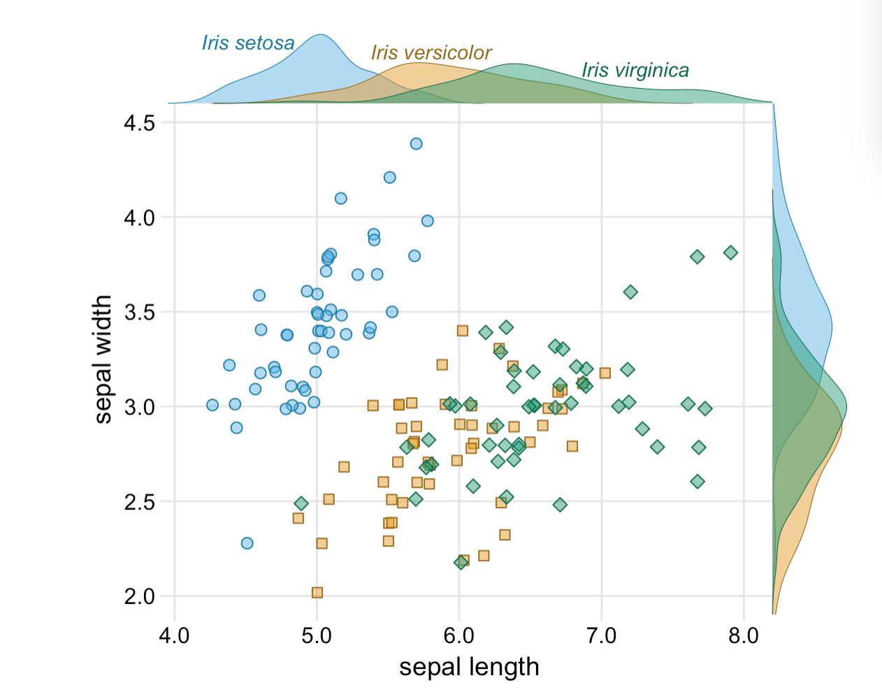
 is available on git.
Everything is possible with ggplot in R. I realized that again today when plotting some climate data with different colour, shapes and fill. Color showed different precipitation levels, shape showed different temperature levels and I wanted filled symbols for the short term data and filled symbols for the long term data set. The complication was that the filled symbol depended as well on the precipitation level.
My solution was to manually fit different colours for fill, but this messed up the legend. So here comes trick number 2 to manually change the legend.
Let’s have a look at the plots and create a data set. There are 2 climate variables: temperature and precipitation. A factor for temperature and precipitaion with each 2 levels to define color and shape. And the source of the data (short or long term data).
# create a data set
Data <- data_frame(Temperature = c(8.77, 8.67, 7.47, 7.58, 9.1, 8.9, 7.5, 7.7),
                   Precipitation = c(1848, 3029, 1925, 2725, 1900, 3100,
                                     2000, 2800),
                   Temperature_level = as.factor(c(rep("subalpine", 2),
                                                   rep("alpine", 2),
                                                   rep("subalpine", 2),
                                                   rep("alpine", 2))),
                   Precipitation_level = as.factor(c(rep(c(1,2),4))),
                   Source = c(rep("long term", 4), rep("short term", 4)))
Let’s plot the data using ggplot. We want the filled symbol to be according to the precipitation level. So we use a ifelse statement for fill. If the source is the short term data, then use the precipitation colours, otherwise not. And manually we define the two blue colours and white for the symbols we do not want to have filled.
p <- ggplot(Data, aes(x = Precipitation, y = Temperature,
                      color = Precipitation_level,
                      shape = Temperature_level,
                      fill = factor(ifelse(Source == "short term",
                                           Precipitation_level, Source)))) +
  scale_color_manual(name = "Precipitation level",
                     values = c("skyblue1", "steelblue3")) +
  scale_shape_manual(name = "Temperature level", values = c(24, 21)) +
  # manually define the fill colours
  scale_fill_manual(name = "Source",
                    values = c("skyblue1", "steelblue3", "white")) +
  theme_minimal()
p + geom_point(size = 3)

The colours, shape and fill was plotted correctly, but this trick messed up the legend for the data source. The reason is that fill has 3 levels: 2 precipitation levels and one level for the long term data, which we coloured white.
We need another trick to fix this. We will use another factor with 2 levels and then replace the fill legend. First, we add different size for Source. It can be marginally different or have exacly the same value. This seems silly, but it’s useful to change the legend for fill. For changing the legend “guides” is a useful function. First we remove the fill legend. Then we use size which only has 2 levels and use override to draw different shapes for the two levels. And these shapes represent the filled and unfilled symbols.
p +
  # add size for Source
  geom_point(aes(size = Source)) +
  # defining size with 2 marginally different values
  scale_size_manual(name = "Source", values = c(3, 3.01)) +
  # Remove fill legend and replace the fill legend using the newly created size
  guides(fill = "none",
         size = guide_legend(override.aes = list(shape = c(1, 16))))

So, everything is possible in ggplot. It’s not straight forward code and needed a few tricks to make it work. If you know a quicker way to draw this plot, please let me know!
Thanks, Richard for helping with trick nr. 2!
I’m working on a manuscript on phenology in the SeedClim grid and it is always nice to show the study site in a map. But where to get a decent map. It is possible to download blank maps from the internet, but this requires citing the source. So, I decided to make my own map. After googling a bit I found a nice code for a map of Scandinavia including a grid for the coordinates. Selecting the area and adding the numbers was done in Photoshop.
For R code see below.
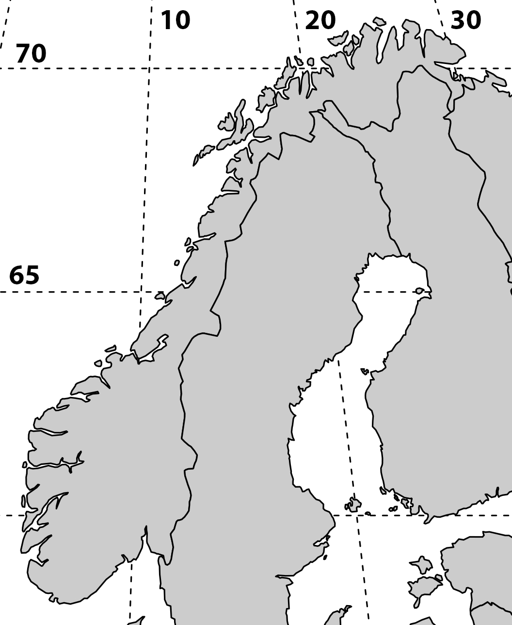
library(„maps“)
library(„mapproj“)
par(mar = rep(0.1,4))
#force map to cover Norway, Finland and Latvia
map(region = c(„Norway“, „Finland“, „Latvia“), proj = „sinusoidal“, type = „n“)
# draw coordinates
map.grid(c(0,40, 55, 80), nx = 5, ny = 5, col = „black“)
map(xlim = c(-130, 130), col = „grey80“, fill = TRUE, proj = „“, add = TRUE)
Code adapted from Musings on Quantitative Palaeoecology
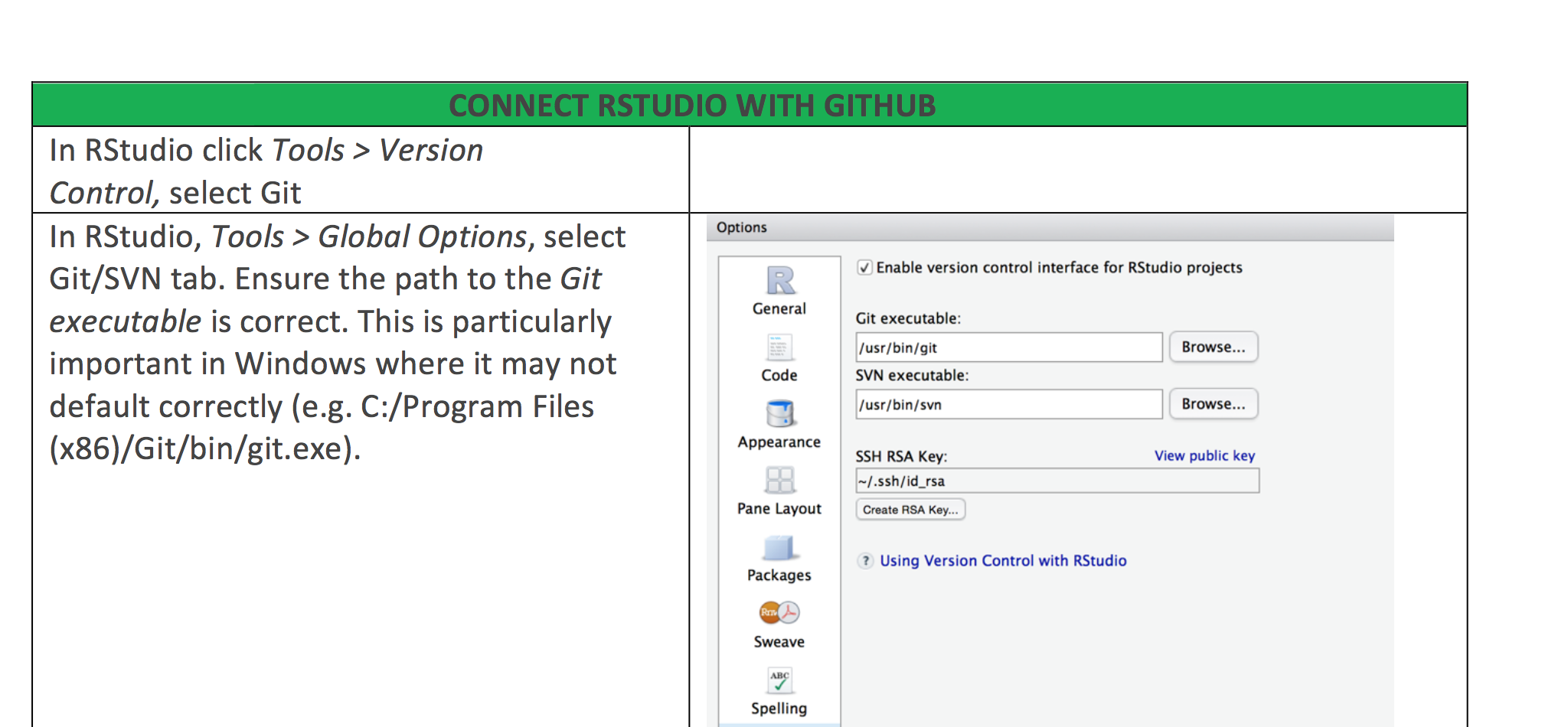
We have recently started to work with Github in our research group and I would never go back. It is a great way to collaborate on code, keep track of changes while coding and also supervising your students coding during their thesis.
Getting RStudio and Github talking can be a bit tricky. And I have put together a some instructions how to make the connection. There are different options, wether you already are on Github and want to connect your repository to a new RStudio project or the other way round, pushing an existing RStudio project on Github.
Here is the Github – R studio Cheat Sheet.