Archiv des Autors: aud

Trait differentiation and adaptation of plants along elevation gradients

New review on trait differentiation and adaptation of plants along elevation gradients.

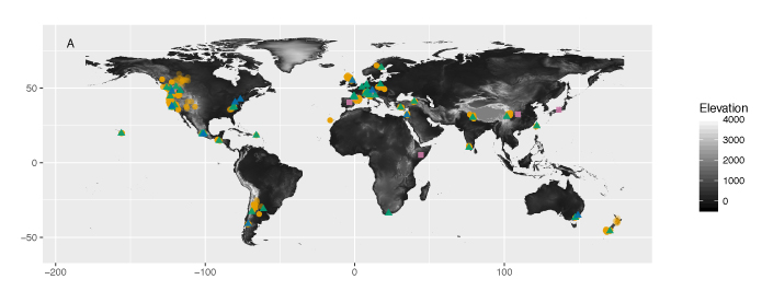
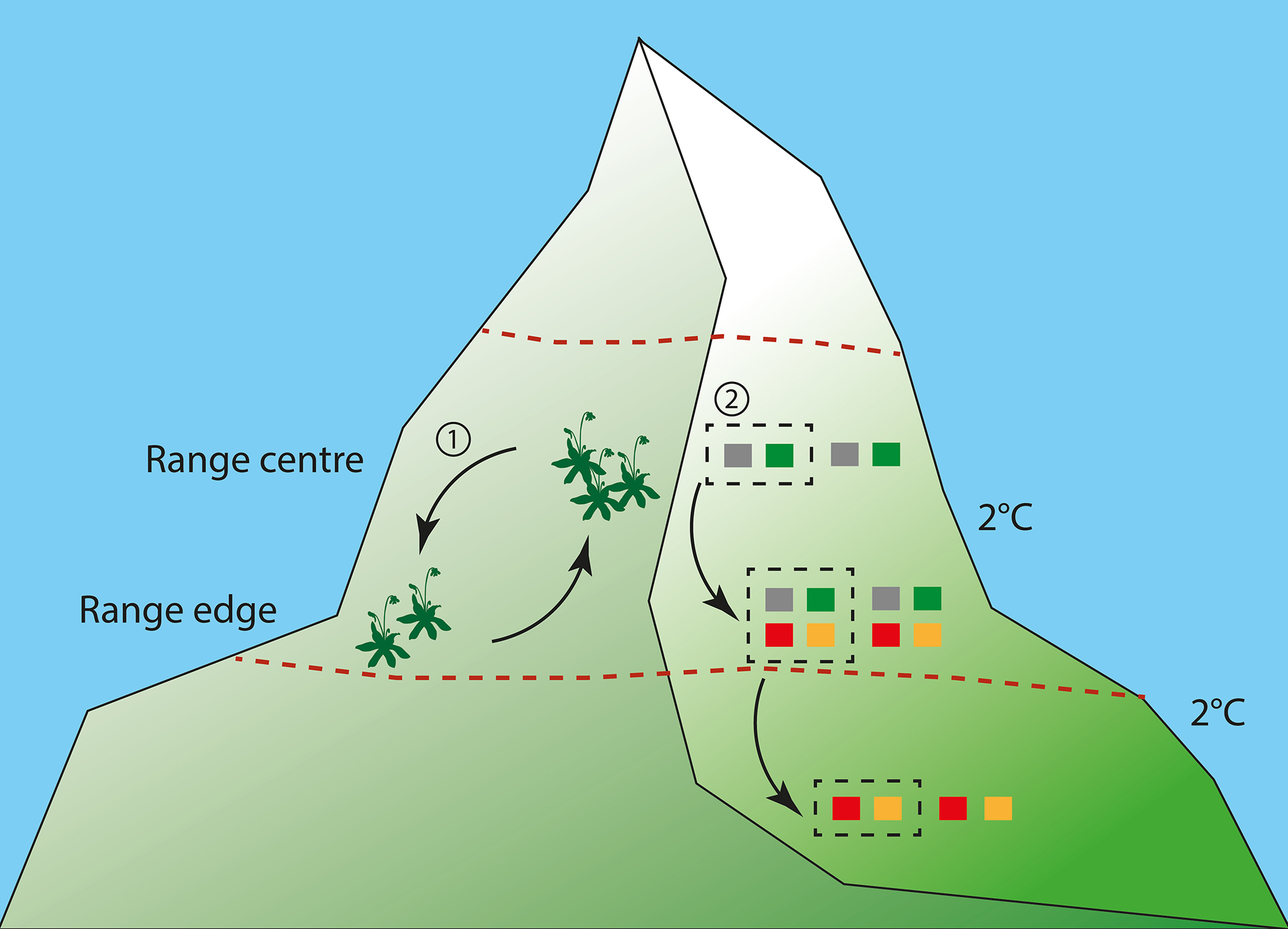
Studies of genetic adaptation in plant populations along elevation gradients in mountains have a long history, but there has until now been neither a synthesis of how frequently plant populations exhibit adaptation to elevation nor an evaluation of how consistent underlying trait differences across species are. We reviewed studies of adaptation along elevation gradients (i) from a meta‐analysis of phenotypic differentiation of three traits (height, biomass and phenology) from plants growing in 70 common garden experiments; (ii) by testing elevation adaptation using three fitness proxies (survival, reproductive output and biomass) from 14 reciprocal transplant experiments; (iii) by qualitatively assessing information at the molecular level, from 10 genomewide surveys and candidate gene approaches. We found that plants originating from high elevations were generally shorter and produced less biomass, but phenology did not vary consistently. We found significant evidence for elevation adaptation in terms of survival and biomass, but not for reproductive output. Variation in phenotypic and fitness responses to elevation across species was not related to life history traits or to environmental conditions. Molecular studies, which have focussed mainly on loci related to plant physiology and phenology, also provide evidence for adaptation along elevation gradients. Together, these studies indicate that genetically based trait differentiation and adaptation to elevation are widespread in plants. We conclude that a better understanding of the mechanisms underlying adaptation, not only to elevation but also to environmental change, will require more studies combining the ecological and molecular approaches.

ggplot with colour, shape and colour depending fill

Everything is possible with ggplot in R. I realized that again today when plotting some climate data with different colour, shapes and fill. Color showed different precipitation levels, shape showed different temperature levels and I wanted filled symbols for the short term data and filled symbols for the long term data set. The complication was that the filled symbol depended as well on the precipitation level.

My solution was to manually fit different colours for fill, but this messed up the legend. So here comes trick number 2 to manually change the legend.

Let’s have a look at the plots and create a data set. There are 2 climate variables: temperature and precipitation. A factor for temperature and precipitaion with each 2 levels to define color and shape. And the source of the data (short or long term data).

# create a data set
Data <- data_frame(Temperature = c(8.77, 8.67, 7.47, 7.58, 9.1, 8.9, 7.5, 7.7),
                   Precipitation = c(1848, 3029, 1925, 2725, 1900, 3100, 
                                     2000, 2800),
                   Temperature_level = as.factor(c(rep("subalpine", 2), 
                                                   rep("alpine", 2), 
                                                   rep("subalpine", 2), 
                                                   rep("alpine", 2))),
                   Precipitation_level = as.factor(c(rep(c(1,2),4))),
                   Source = c(rep("long term", 4), rep("short term", 4)))

Let’s plot the data using ggplot. We want the filled symbol to be according to the precipitation level. So we use a ifelse statement for fill. If the source is the short term data, then use the precipitation colours, otherwise not. And manually we define the two blue colours and white for the symbols we do not want to have filled.

p <- ggplot(Data, aes(x = Precipitation, y = Temperature, 
                      color = Precipitation_level, 
                      shape = Temperature_level, 
                      fill = factor(ifelse(Source == "short term", 
                                           Precipitation_level, Source)))) +
  scale_color_manual(name = "Precipitation level", 
                     values = c("skyblue1", "steelblue3")) +
  scale_shape_manual(name = "Temperature level", values = c(24, 21)) +
  # manually define the fill colours
  scale_fill_manual(name = "Source", 
                    values = c("skyblue1", "steelblue3", "white")) +
  theme_minimal()
p + geom_point(size = 3)

plot of chunk unnamed-chunk-3

The colours, shape and fill was plotted correctly, but this trick messed up the legend for the data source. The reason is that fill has 3 levels: 2 precipitation levels and one level for the long term data, which we coloured white.

We need another trick to fix this. We will use another factor with 2 levels and then replace the fill legend. First, we add different size for Source. It can be marginally different or have exacly the same value. This seems silly, but it’s useful to change the legend for fill. For changing the legend “guides” is a useful function. First we remove the fill legend. Then we use size which only has 2 levels and use override to draw different shapes for the two levels. And these shapes represent the filled and unfilled symbols.

p + 
  # add size for Source
  geom_point(aes(size = Source)) +
  # defining size with 2 marginally different values
  scale_size_manual(name = "Source", values = c(3, 3.01)) +
  # Remove fill legend and replace the fill legend using the newly created size
  guides(fill = "none", 
         size = guide_legend(override.aes = list(shape = c(1, 16))))

plot of chunk unnamed-chunk-4

So, everything is possible in ggplot. It’s not straight forward code and needed a few tricks to make it work. If you know a quicker way to draw this plot, please let me know!

Thanks, Richard for helping with trick nr. 2!

Plastic and genetic responses to shifts in snowmelt time

Our new article on plastic and genetic responses to shifts in snowmelt time in Ranunculus acris has just been accepted in PPEES. I will present the study at the ESA in Portland in August.

Changes in both temperature and precipitation will affect snowmelt time at high elevation, thereby influencing plant reproduction and growth. Species can respond to changed climate with phenotypic plasticity or genetic adaptation, and these responses might vary at different levels of advanced and delayed snowmelt time. Here we mimicked future climate change projections for western Norway by transplanting individuals of Ranunculus acris towards warmer, wetter and warmer & wetter climates. And we replicated the experiment along regional-scale temperature and precipitation gradients. This setup resulted in both advanced (warmer and warmer & wetter transplants) and delayed (wetter transplants) snowmelt in the experimental sites. We recorded phenological development and growth over one growing season.

The reproductive phenology of the transplanted R. acris individuals was affected by both phenotypic plasticity and genetic differences between populations of different origins, while growth showed only plastic responses. Plants expressed high plasticity to both advanced and delayed snowmelt time by acceleration of the onset of buds, flowers and fruits. Only the plants from wet and high-elevation sites showed a small response to advanced SMT. The late snowmelt time these populations experience could potentially cause high selection pressure leading to more constrains in plasticity. When grown under common conditions, plants from late snowmelt sites responded with earlier onset of phenological development, suggesting that the timing of snowmelt exerts strong selection on reproduction. To project species fates under future climate we need to consider the interplay between genetic adaptation and plastic responses under different climate contexts, especially towards the species range limits.

Plasticity and genetic difference in growth (top) as the difference in leaf size +/- 2SE in cm (top) and first flowering in days after snowmelt timing (SMT; bottom) between treatment and origin-control (left) or destination-control (right) plants. The x-axis represents the difference in SMT between origin and destination site. The colours indicate the transplant treatments to: warmer (red), wetter (blue) and warmer & wetter (purple) climate. Points above/below the dashed grey line indicate larger/smaller leaf size or earlier/later days since SMT for first flowering in the transplanted plants compared to the origin-control (left) or destination-control (right) plants. Closed circles indicate a significant difference between treatment and destination-control plants and open circles no significant difference. Dashed error bars indicate a sample size lower than 6 individuals.

Delnevo, N., Petraglia, A., Carbognani, M., Vandvik, V. and Halbritter, A.H. (accepted). Plastic and genetic responses to shifts in snowmelt time affects the reproductive phenology and growth of Ranunculus acris. PPEES.


Landpress project

Heathland are costal habitats shaped by humans hundreds of years ago. They were burned to clear the land for their animals. Burning the heathland was continued to improves the fodder quality and prevent shrubs and trees to grow in the heathland.

In 2014 an intensive drought led to heather death along the coast of Norway. Landpress tests whether heather burning is an effective measure to prevent drought damage and restore damaged moorland.

Last week, one of the sites, close to Bergen was burned.

Scientific poster

Young scientists might present their master thesis or the idea of you PhD with a poster instead of a presentation. At my first conference, I presented a poster and was relieved not having to speak to hundreds of people.

But making a good poster (that people actually read) is difficult and takes time. Don’t do it last-minute!

Here I found a useful guide to make a poster by Colin Purrington.


More maps

I’m working on a manuscript on phenology in the SeedClim grid and it is always nice to show the study site in a map. But where to get a decent map. It is possible to download blank maps from the internet, but this requires citing the source. So, I decided to make my own map. After googling a bit I found a nice code for a map of Scandinavia including a grid for the coordinates. Selecting the area and adding the numbers was done in Photoshop.

For R code see below.

library(„maps“)
library(„mapproj“)
par(mar = rep(0.1,4))

#force map to cover Norway, Finland and Latvia
map(region = c(„Norway“, „Finland“, „Latvia“), proj = „sinusoidal“, type = „n“)

# draw coordinates
map.grid(c(0,40, 55, 80), nx = 5, ny = 5, col = „black“)
map(xlim = c(-130, 130), col = „grey80“, fill = TRUE, proj = „“, add = TRUE)

Code adapted from Musings on Quantitative Palaeoecology